Table of Contents
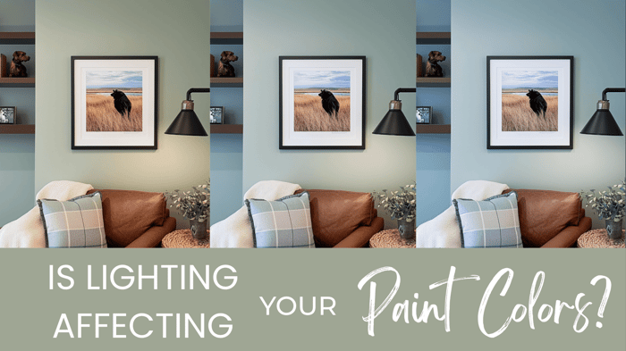
Ever fallen in love with a paint color in a magazine or a friend’s home, only to find it looks totally different on your walls? You’re not imagining things — lighting can change things!
Why Lighting Matters
Light can completely transform the way a paint color appears. The direction your room faces, the time of day, and even the bulbs you use all affect color tone, brightness, and warmth.
Typically, I don't worry about directional lighting too much, because you'll probably get multiple sources of directional light throughout your home; and because natural daylight changes throughout the day. But, if your home gets strong directional light this may be a consideration for you.
Let’s break it down:
Natural Light: Directional Considerations:
North-Facing Rooms
Cooler, softer light makes colors appear darker and grayer.
Try: Warm neutrals like SW Accessible Beige or BM White Dove.
South-Facing Rooms
Bright, warm light makes colors appear lighter and more vibrant.
Try: Richer non-neutral colors, or greige colors like SW Analytical Gray or BM Pashmina.
East-Facing Rooms
Warm light in the morning, cooler in the afternoon.
Try: Breezy tones like SW Sea Salt or BM Gray Cashmere.
West-Facing Rooms
Warm afternoon light enhances reds and oranges.
Try: Muted or cooler tones like SW Mindful Gray or BM Classic Gray.
💡 Easy win: When in doubt, choose midtone colors — they adapt best to changing light.
Artificial Light: Bulbs Matter More Than You Think
Your bulbs’ temperature (listed in Kelvins, or K) can warm up or cool down your paint color dramatically.
Warm White (2700K–3000K): Soft, cozy glow — best for interiors.
My pick: 3000K for balanced warmth.Cool White (3500K–4100K): Brighter, cooler light — can flatten warm tones.
Daylight (5000K+): Harsh and sterile — avoid for interiors, it washes color out.
💡 Easy win: Check bulb temps before you start sampling paint, and switch to a 3000k if necessary — it could change your paint selections!
Test Before You Commit
By now you know colors change throughout the day. The best strategy is to leave your samples up and view them throughout the day in all the rooms you plan on using that color.
It is possible you may not 100% love every color in every space, and that is okay (and also normal!) — you are looking for the color you like the most, most of the time.
Taking time to sample this way will save you tons of money on paint, and possibly labor. TRUST ME. I speak from experience :)
Here’s how:
Paint a sample or use peel-and-stick swatches.
Observe morning, afternoon, and evening (artificial) light.
Compare next to trim, flooring, hard materials (like counters and tile), and fabrics.
💡 Pro tip: Always test with your actual bulbs — not just daylight.
Designer-Approved “Go-To” Colors
If lighting feels tricky, here are some shades that tend to perform well for many homes, across different rooms and light types:
Warm Neutrals: SW Accessible Beige, BM Smokey Taupe
Soft Whites: SW Alabaster, BM Swiss Coffee
Timeless Blues: SW Sea Salt, BM Palladian Blue
💡 Easy win: Keep a few of your favorite samples on a labeled “lighting board” to reuse when testing new spaces.
Final Thought
Lighting is the most overlooked part of color selection — but once you understand it, color selection can be less stressful. Test your paint under your conditions, and you’ll save yourself endless frustration (and repainting). If you're unsure where to start in your paint selection, grab a Millie Hart Interiors palette and remove the guesswork!
Happy Painting!