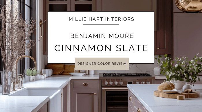
Today, I want to chat about a color I’ve been getting a lot of messages about – it’s Cinnamon Slate. This is Benjamin Moore’s 2025 Color of the Year, and frankly, I'm kind of obsessed. This earthy hue walks the line between a deep taupe and a softened clay, and it’s an intriguing option for anyone who wants to break away from standard neutrals without getting too crazy.
Benjamin Moore’s Cinnamon Slate (2113-40) feels both sophisticated and cozy. It’s a warm, muted shade that brings a rich warmth to interiors, making it a fantastic choice for those who are looking for a bold, yet grounding color in their space.
What Does Cinnamon Slate Look Like?
Cinnamon Slate is a timeless plum color. It is a deep, muted, and complex purple; with warm brown and subtle reddish undertones. While it is muted, it carries enough warmth to feel inviting rather than heavy. Unlike traditional purples, the brown undertones in this color create a refined elegance. The color is also saturated without being overwhelming, and is a great choice for those who want depth and richness without going too dark.
What Are the Undertones?
The main undertones of this color are brown, with a wink of red, and a subtle violet influence. These undertones give it a dynamic quality, making it feel cozy and inviting rather than heavy or dull. Cinnamon Slate can sometimes lean a little moody, or sophisticated depending on the environment. I love a good moody color, and find the warmth in Cinnamon Slate is unique to moodier shades. If you’re pairing it with other colors, warm neutrals or complementary cool tones are good choices.
What Is the LRV of Cinnamon Slate?
Cinnamon Slate has an LRV (Light Reflectance Value) of around 20, meaning it absorbs more light than it reflects. This makes it a medium-dark shade. Since it does absorb more light, I would choose this color for cozy, intimate spaces, rather than areas where you need a bright, airy feel.
Is Cinnamon Slate Warm or Cool?
Cinnamon Slate is definitely a warm color. The brown and subtle red-violet undertones make it feel cozy and rich rather than stark or crisp.
What Exposures Work Well With This Color?
While it is true that color interacts with natural light, and this will influence how warm or muted it appears, I do not typically worry about this too much. Directional light changes multiple times throughout the day, so ideally, you’re looking for a color that you like in your space most of the time. However, I still get a lot of questions about directional lighting, so here’s what to expect from Cinnamon Slate based on a room’s exposure:
North-facing rooms – Light from the north is cooler and often soft, which can make Cinnamon Slate appear a little more muted and even slightly moodier.
South-facing rooms – The warm, golden light from the south will enhance the warmth in Cinnamon Slate, making it appear more inviting and rich.
East-facing rooms – Morning light will bring out more of the color’s vibrancy, while afternoons might make it feel deeper and moodier.
West-facing rooms – Expect the color to be fairly neutral in the morning, but by afternoon and evening, the warm light will amplify its richness, enhancing its cinnamon undertones.
Best Rooms to Use Cinnamon Slate In
- Dining rooms – Creates an elegant, intimate atmosphere that is cozy and inviting for gatherings.
- Bedrooms – Perfect for restful spaces, it works well for a warm, cocoon-like atmosphere.
- Libraries/studies – Adds depth and sophistication to spaces meant for focus and relaxation.
- Living rooms – Pairs well with earthy textures and warm lighting for a cozy yet refined feel.
- Accents – If you’re not ready for a full-room commitment, Cinnamon Slate is a gorgeous color for a feature wall or powder room vanity.
What Wood Tones Work Best With This Color?
Cinnamon Slate is fantastic with warm and medium wood tones, such as:
Walnut – Enhances the richness of both the color and the wood.
Mahogany – Deep and sophisticated when paired together.
Warm oak – A classic pairing that feels organic and timeless.
Cherry wood – The red undertones complement Cinnamon Slate beautifully.
What Materials and Finishes Compliment This Color?
- Natural woods – Adds to the earthy, warm aesthetic.
- Matte and velvet textures – Enhance the cozy feel.
- Leather – Works well with brown and camel tones.
- Stone (marble, Travertine, slate) – Adds contrast and elegance.
What Furniture Colors Compliment Cinnamon Slate?
- Deep greens – Olive or forest green creates a stunning contrast.
- Warm neutrals – Beige, cream, and taupe soften the boldness of Cinnamon Slate.
- Charcoal gray – Adds a touch of modern sophistication.
- Muted blues – Dusty or navy blues offer balance and contrast.
- Brass and gold accents – Warm metallics highlight its richness.
What Design Styles Work Well with Cinnamon Slate?
Cinnamon Slate complements so many styles. Here are some from the top of my list:
Modern Rustic – Complements wood, stone, and natural textiles beautifully.
Mid-Century Modern – Pairs well with warm wood tones and vintage-inspired pieces.
Traditional – Looks classic with deep wood stains and warm neutrals.
Bohemian – Pairs well with layered textures, woven materials, and earthy palettes.
Industrial – Complements raw materials like exposed brick and black metals.
Transitional - Works well with warm neutrals, gold accents, and soft furnishings.
Maximalist - Gorgeous in a color-drenched room with moody, jewel-toned accents and furnishings.
Cottagecore - Pairs well with the earthy, floral and vintage decor that defines this style.
Is This a Good Color for Doors and Trim?
In the right homes or with the right design styles, yes. Cinnamon Slate can make a stunning statement, especially in warm, moody interiors. However, as a door and trim color, I see it working best in Victorian or historic homes; or in a Cottagecore, Maximalist, or similar design style. It can also be used in a color drenched room.
Keep in mind - color drenching and specific design styles are trending right now. In about five to ten years, you’ll probably want to replace a trending look. Painting doors and trim is one of the more expensive and time-consuming painting projects, so that’s something to consider.
Rather than going all-in with whole-house doors and trim, if you want Cinnamon Slate on these elements, I would use it on a smaller scale, like a single color-drenched room, built-ins, or cabinets. These will be easier to refresh down the road.
Who Is Cinnamon Slate Best For?
This color is ideal for anyone who wants to create a warm, inviting, and sophisticated space:
Homeowners who love warm, earthy tones but want something beyond beige or taupe
Those looking for a refined, moody color that still feels cozy
Anyone who appreciates depth and subtle complexity in their paint colors
It's perfect for those who appreciate earthy tones and want something a little more unique than your standard brown or gray.
Final Thoughts: Would I Recommend Cinnamon Slate?
Um, yes, absolutely! Cinnamon Slate is a beautiful, easy to love color. It is warm and earthy, and it is perfectly content to stand quietly in the background; or take center stage and make a statement.
Cinnamon Slate is rich, grounding, and timeless; and is a fantastic choice for those who love depth and warmth in their interiors. Whether on walls, cabinets, or an accent, this color adds sophistication and character to any space.
If you’re thinking of using Cinnamon Slate in your next project, make sure you pick up a sample from my favorite online sample spot, Samplize. And, if you’re looking for a palette of colors that works well with Cinnamon Slate, check out these options:
Happy painting!
-Millie