Table of Contents
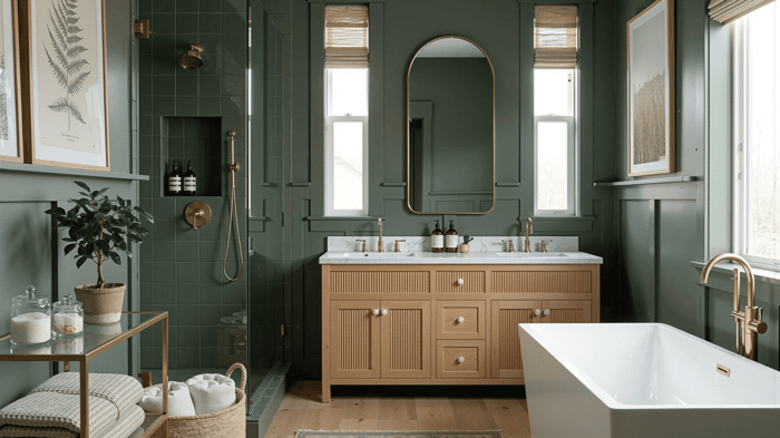
I’ve used Benjamin Moore Vintage Vogue in a few very different spaces, and I love the results every time. It has depth, but it doesn’t feel heavy, and it's rich without becoming dramatic in a way that takes over the room. I guess “sophisticated” is a great definition! If you’re looking for a darker green that still feels usable day to day, this one is worth checking out.
What Vintage Vogue Actually Looks Like
Benjamin Moore Vintage Vogue is a deep, muted green with a slightly softened, natural look. It sits somewhere between a classic forest green and an olive tone, but it’s more refined than either.
It doesn’t come across as crisp or bright. Instead, it has a grounded quality that makes it feel settled and intentional on the wall.
In most spaces, it reads as:
A dark green with subtle softness
Slightly earthy, but not overly warm
Rich without feeling over-the-top
Vintage Vogue Undertones
The undertones in this color really work in unexpected ways. I love this color for its balance and subtle earthiness.
Vintage Vogue leans:
Warm green at its core
Has a subtle olive undertone
And a slight gray influence that keeps it from feeling too saturated
Because of that balance, it avoids the issue of turning too blue or too yellow on the wall.
In different lighting:
South-facing rooms bring out a more natural, softened green
North-facing rooms can make it feel deeper and slightly moodier
Artificial warm lighting pulls out more of the olive base
LRV and What It Means in Real Spaces
Vintage Vogue has an LRV of 11.85, which puts it firmly in the dark range.
What that actually means:
It absorbs a significant amount of light
It will read noticeably darker in low-light rooms
It creates contrast easily against lighter trim and surfaces
In real use:
In bright rooms, it still holds depth without flattening out
In darker spaces, it can feel cozy, but you need to balance it with lighting and lighter elements
This is not a color that disappears into the background, it has presence for sure - however, it’s quieter and softer. I love this in a quiet luxury palette!
Where I Actually Use It
Vintage Vogue is gorgeous. I find it works beautifully when you lean into its depth instead of trying to soften it too much.
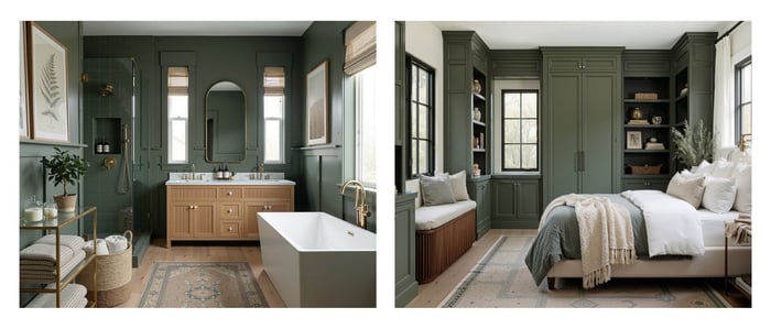
I love it in:
Dining rooms where you want a more intimate feel
Home offices where deeper tones help reduce visual distraction
Powder rooms where you can go darker without committing a full space
Accent walls when the rest of the palette is lighter
It also works well on cabinetry if you want something darker than a typical sage but softer than a near-black green.
What It Pairs Well With
Vintage Vogue is flexible, but it looks best when paired with materials that match its depth.
Strong pairings:
Warm whites like creamier trim colors
Natural wood tones, especially medium to dark stains
Brushed brass or aged bronze finishes
Soft neutrals like beige, taupe or warm grays with taupe undertones
It can also handle contrast:
Crisp white for a cleaner, more tailored look
Black accents for a more modern edge
Design Styles It Fits Into
This is not a trendy green. It leans more classic, but it adapts well.
It fits naturally into:
Traditional interiors
Transitional spaces (love it here!)
Moody modern designs
English-inspired or heritage styles
It brings structure to a room rather than acting as a light, decorative color.
When I Wouldn’t Use It
There are a few situations where Vintage Vogue can work against you:
Small, low-light rooms with limited lighting
It can feel heavier than intendedSpaces where you want an airy or open feel
This color is dark (obviously), so it adds a little weightRooms with a lot of cool-toned finishes
The warmth in the green can feel slightly off
If you’re aiming for something brighter or more casual, this probably isn’t the right direction.
Final Thought
Vintage Vogue is a color that settles in beautifully in many spaces. It doesn’t shift unpredictably, and it doesn’t demand a lot of attention, but it still gives the room a strong point of view.
If you want a darker green that feels grounded, slightly traditional, and easy to live with, this is a solid choice that holds up over time.
Ready to Pull a Whole Look Together?
If you love Vintage Vogue and want to try it in your home, I put together a palette designed around this gorgeous color. It’s designed to help everything flow room to room without, giving you plenty of options to personalize how you'll use it, without over-thinking every choice. I'll link it below for you to take a peek at :)
Happy Painting,
Millie
Vintage Vogue Benjamin Moore Paint Palette | Timeless Neutral Interior Paint Colors | Transitional Warm Neutral Color Scheme

$28.00
The Vintage Vogue Paint Palette - featuring 9 Benjamin Moore paint colors, professionally curated by Millie Hart Interiors. Perfectly balanced warm whites, light warm neutrals that layer beautifully, and Vintage Vogue as the anchor - a deep, earthy green that… read more
FAQs
Is Benjamin Moore Vintage Vogue a warm or cool green?
Vintage Vogue leans warm. It has a soft olive undertone that keeps it from feeling too crisp or blue. The slight gray influence helps balance that warmth so it doesn’t feel overly earthy.
What is the LRV of Vintage Vogue?
The LRV is 7.25. That puts it firmly in the dark range, meaning it absorbs a lot of light and will read deeper on the wall, especially in lower-light spaces.
Does Vintage Vogue work in small rooms?
It can, but you need to be intentional. In a small room with limited light, it can feel quite deep and enclosed, so it’s not ideal if you’re trying to keep a small space light and open... but, this color can (and does) work really well for a powder room or cozy office, or other small space where you want a little drama or coziness.
Does Vintage Vogue look more green or more olive?
Most of the time, it reads as a deep green first. The olive undertone shows up subtly in warm lighting, or when paired with warm materials like wood and brass.
What trim color works best with Vintage Vogue?
Warm whites tend to work best. Look for softer whites, like Swiss Coffee or White Dove rather than stark, cool whites.
Can Vintage Vogue be used on kitchen cabinets?
Yes! Love it on cabinetry. It gives you depth and contrast without going as dark as a near-black green. It pairs especially well with brass hardware and natural wood accents.
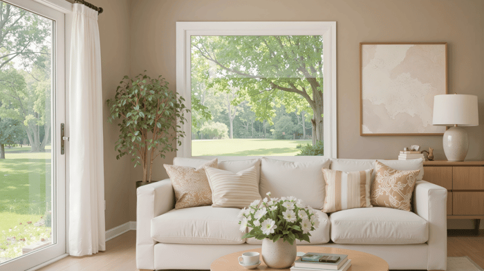
Is Vintage Vogue too dark for a living room?
Not necessarily. In a well-lit living room, it creates a grounded, comfortable feel. In a darker space, you’ll want to balance it with lighter furniture, rugs, and good lighting. There's also always an option to use it as an accent or feature, you don't have to color drench!