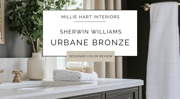
If you're craving a rich, moody color that still feels grounded and livable, let me introduce you to Sherwin Williams Urbane Bronze. This deep, earthy brown with soft charcoal undertones has been a go-to favorite in my design toolkit for years—and for good reason. It's bold without being harsh, warm without being muddy, and sophisticated without trying too hard. Whether you're creating a cozy accent wall, painting cabinetry, or going all-in on a dramatic space, Urbane Bronze has serious staying power. Here's why I keep reaching for this one:
What Color is Urbane Bronze?
Urbane Bronze is a deep, warm brown with hints of gray and a whisper of green undertone that gives it a grounded, organic vibe. It feels like the color of aged wood, weathered stone, or rich earth—elegant and timeless. It is darker than most people expect from a neutral, but I believe that’s one of the reasons its so versatile. Urbane Bronze is equally at home in a moody modern space, or a traditional setting full of natural textures.
Undertones of Urbane Bronze
Urbane Bronze has strong brown and charcoal undertones, but the very subtle green underneath keeps it from reading too warm or too flat. Depending on your lighting, the color might lean more earthy brown, deep taupe, or even a rich charcoal. It shifts just enough to feel dynamic without losing its grounding quality.
What is the LRV of Urbane Bronze?
Urbane Bronze has an LRV (Light Reflectance Value) of 8, which places it firmly in the dark category. It doesn’t reflect a lot of light, but it’s not black—think of it more as a deep, velvety backdrop. Because of that, it adds drama and depth to a space while still feeling cozy. I personally love it in rooms where you want a little mood and contrast.
Is Urbane Bronze Warm or Cool?
Urbane Bronze is technically a warm color, but it has enough gray in it to keep it feeling balanced. It doesn’t have the red or orange undertones that can make other dark browns feel dated. Instead, it leans earthy and subtle—rich without being overpowering. If you want warmth in a dark color without veering into chocolate brown or espresso, this one’s for you.
How Lighting Affects Urbane Bronze
Here's what I've observed when using Urbane Bronze in different spaces:
North-facing rooms: This is where Urbane Bronze really leans into its charcoal side, feeling cool and moody—almost like a dark taupe.
South-facing rooms: Warm light brings out the richness of the brown undertones, making the color feel enveloping and luxurious.
East-facing rooms: In morning light, it reads a little cooler and more gray.
West-facing rooms: The afternoon glow adds warmth and depth, giving it a lush, earthy feel.
Where I Love Using Urbane Bronze
Feature and Accent Walls: It’s an instant mood-setter behind a bed, fireplace, or in a dining room.
Cabinetry: Perfect for kitchens or built-ins—especially paired with brass or black hardware.
Exteriors: Looks stunning with stonework, wood accents, and creamy trim colors.
Bathrooms: For a spa-like, cozy retreat vibe.
Offices & Libraries: This is where Urbane Bronze thrives. Add wood, leather, and low lighting, and you’re in cozy heaven.
Is Urbane Bronze a Good Choice for Trim or Doors?
Yes, and yes. I love Urbane Bronze on front doors, interior doors, and even window trim when you want a bold, modern contrast. It's also a beautiful choice for baseboards or wainscoting if you're after that high-drama, or color-drenched look. Pair it with a white like Sherwin Williams Greek Villa or Pure White to let it really pop.
Best Design Styles for Urbane Bronze
Modern Organic: Pairs beautifully with stone, wood, and layered neutrals.
Transitional: A dramatic yet classic backdrop for mixed textures and finishes.
Traditional: Think rich wood furniture, brass lighting, and leather accents.
Minimalist: Makes a bold statement when used simply and intentionally.
Industrial: Incredible when paired with metal, concrete, and exposed wood.
Best Wood Tones to Pair with Urbane Bronze
Natural Walnut: Gorgeous, rich-on-rich pairing.
White Oak: Provides just enough contrast and brightness.
Dark Stained Woods: Creates depth and formality—perfect for a study or dining room.
Weathered or Reclaimed Wood: Adds a rustic, organic layer that softens the depth.
Furniture, Decor & Material Pairings
Neutrals: Creams, soft whites, and warm taupes for balance.
Accent Colors: Terracotta, burnt orange, olive green, camel, and soft blues.
Metals: Aged brass, matte black, and oil-rubbed bronze.
Textiles: Linen, velvet, leather, and chunky knit throws.
Stone & Tile: Slate, travertine, soapstone, or concrete for that grounded, natural feel.
Who Will Love Urbane Bronze?
Homeowners who aren’t afraid of a little drama.
People who want a cozy, sophisticated feel without using black or navy.
Anyone looking to anchor a space with a rich, earthy color.
Design lovers who lean toward natural materials and layered textures.
When to Skip It
Very small or windowless rooms where you want to maximize light—unless you’re intentionally going for a moody cocoon vibe.
If your fixed materials are cool-toned gray, the undertones may clash.
Ultra-modern, stark white spaces might not be the best backdrop for Urbane Bronze unless you’re leaning into contrast.
My Final Take
Sherwin Williams Urbane Bronze is a design power move—but one that still feels incredibly livable. It adds depth, contrast, and a sense of calm all at once. Whether you’re painting a whole room, just the cabinetry, or a bold front door, this is one of those colors I can confidently recommend to clients who want something rich, timeless, and just a little unexpected.
If you're thinking of using Urbane Bronze in your home, and want a whole-house palette with colors that compliment it, here are a couple of Millie Hart Interiors palettes to take a peek at:
- Sherwin Williams Evergreen Fog Palette
- Sherwin Williams Moody Earth Tones Palette
- Sherwin Williams Desert Bohemian Palette
As always, when considering new paint colors for your home, it's so important to sample all colors before making final selections. If you ever take one piece of advice from me, let it be this :)
For easy, mess-free sampling, I love using large, peel-and-stick samples - like the ones offered by Samplize. You can also get large-format samples from Sherwin Williams' website.
Happy Painting,
Millie