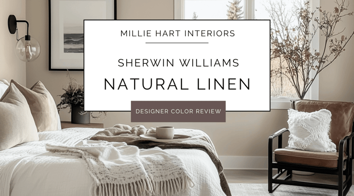
If you’ve been searching for a soft, approachable neutral that feels effortlessly warm without going too yellow or too beige, let me introduce you to Sherwin Williams Natural Linen. This one has been showing up on my client boards a lot lately, and I’m not even a little bit surprised—it’s just so good!
Whether you’re looking to brighten up a whole room or create a cozy backdrop for your favorite decor, Natural Linen is one of those shades that just works.
What Color is Natural Linen?
Natural Linen is a soft, warm neutral that sits somewhere between beige and cream. It has this airy, sun-kissed quality that makes a room feel fresh - like the color of a favorite linen shirt—soft, breathable, and completely timeless. It’s not too yellow, not too gray, and not too pink… it’s just right.
Undertones of Natural Linen
Natural Linen carries subtle beige and cream undertones that lean ever so slightly toward the warm side. But don’t worry—it doesn’t feel overly golden or buttery. I like to think of it as a safe middle ground for those who want warmth without going full-on yellow or tan. Depending on your lighting, you might notice the faintest touch of pink or peach peeking through, but it’s so soft that it keeps the color feeling balanced and natural.
What is the LRV of Natural Linen?
Natural Linen has an LRV (Light Reflectance Value) of 66, making it a light-medium neutral. It reflects a good amount of light without feeling stark or washed out. I find it works beautifully in rooms that need a little warmth and brightness but don’t have a ton of natural light to work with.
Is Natural Linen Warm or Cool?
This is definitely a warm neutral, but it’s not so warm that it feels dated or heavy. It brings just the right amount of coziness to a space while still feeling fresh and modern. If you’re looking for something softer than gray but not as deep as a traditional beige, I think you’ll love how this one plays in your home.
How Lighting Affects Natural Linen
Here’s what I’ve noticed after using Natural Linen in different spaces:
North-facing rooms: The cool light in these spaces can bring out a slight gray or taupe undertone, keeping the color from feeling too warm.
South-facing rooms: The warm, direct sunlight enhances the creamy, inviting warmth of Natural Linen.
East-facing rooms: You’ll get a soft, warm glow in the morning that feels incredibly cozy.
West-facing rooms: Afternoon light brings out the color’s creamy depth, making it feel richer and more saturated.
Where I Love Using Natural Linen
Living Rooms: It’s perfect for creating a welcoming, light-filled space without feeling sterile.
Bedrooms: Feels cozy and calming, especially when paired with soft whites and layered textures.
Hallways and Entryways: Brightens these transitional spaces beautifully.
Kitchens: Works well on walls to complement wood tones, stone countertops, and warm metals.
Exteriors: Yes! It’s soft enough for siding or stucco, especially when paired with warm white trim.
Is Natural Linen a Good Choice for Doors and Trim?
While I personally prefer to see this color on walls, I could see it working for doors and trim in a color-drenched, tone-on-tone look. That said, I typically recommend pairing it with a soft white like Sherwin Williams Alabaster or Greek Villa for trim. This keeps everything feeling light, layered, and intentional.
Best Design Styles for Natural Linen
Traditional: Pairs beautifully with classic trim and timeless furnishings.
Transitional: Works with both modern and traditional elements.
Farmhouse: Perfect with warm woods and cozy textures.
Coastal: Feels light and breezy when paired with soft blues and sandy tones.
Modern Organic: Looks stunning with layered neutrals and natural materials.
Best Wood Tones to Pair with Natural Linen
Light Oak or Maple: Brings out the soft, warm character.
Walnut or Espresso: Adds contrast and depth.
Weathered Wood or Driftwood: Creates a relaxed, organic vibe.
Furniture, Decor & Material Pairings
Neutrals: Soft whites, warm grays, and taupes.
Textiles: Linen, cotton, wool, and woven textures.
Accent Colors: Sage green, dusty blue, terracotta, or muted blush. I typically go for deeper shaded of these colors, so there's enough contrast for each color to breathe a little - something with an LRV in the 40s (or lower).
Metals: Brushed nickel, matte black, and warm brass.
Tile and Stone: Creamy marbles, travertine, or warm ceramics.
Who Will Love Natural Linen?
Homeowners looking for a warm neutral that feels light and timeless.
Anyone who wants to move away from cool grays but doesn’t want to go too yellow or brown.
Those who love layering soft, earthy tones for a relaxed, inviting space.
When to Skip It
If your space already leans very warm with heavy wood tones, this color might feel a bit too beige.
If you’re after a crisp, modern white or cool-toned neutral, you might want to look elsewhere. Natural Linen loves to be paired with softer options, like warm whites - but you don't have to get too creamy here. Just make sure you're out of the cool white zone.
My Final Take
Sherwin Williams Natural Linen is one of those under-the-radar neutrals that deserves way more love. It’s warm without being heavy, light without feeling washed out, and it works with so many different styles and materials. Whether you’re refreshing a single room or tackling an entire home, this is one of those colors I confidently reach for again and again.
If you're thinking of using Natural Linen in your home, and want a whole-house palette that compliments it, here are a couple of Millie Hart Interiors palettes to take a peek at:
- Sherwin Williams Warm Light Neutrals Palette
- Sherwin Williams Greek Villa - Palette Two
- Sherwin Williams Dried Thyme Palette
As always, when considering new paint colors for your home, it's so important to sample all colors before making final selections. If you ever take one piece of advice from me, let it be this :)
For easy, mess-free sampling, I love using large, peel-and-stick samples - like the ones offered by Samplize. You can also get large-format samples from Sherwin Williams' website.
Happy Painting,
Millie