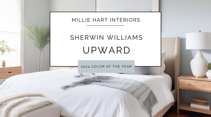
When it comes to choosing the perfect paint color for your home, the options can seem endless. However, if blues are your jam, you might consider Sherwin Williams Color of the Year for 2024, Upward (SW 6239). This delightful shade of blue is more than just a color—it's a mood enhancer, a style setter, and an ambiance creator. I’ve got tons of info for you to explore so you can get a feel for how it can transform your space.
Mood and Ambiance
Upward is a soft, airy blue with a hint of gray, which creates a tranquil and serene ambiance. I often recommend this color for spaces where relaxation and calmness are desired. While this color does have gray undertones, I feel it has a tiny bit more saturation than some other blues with the same depth, and this keeps it from being drab. In the right areas, this creates a space that brings both calm and clarity. It's uplifting without being overwhelming, and can be an excellent choice for creating a restful and rejuvenating environment.
Understanding LRV and Color Depth
Upward has a Light Reflectance Value (LRV) of 57, placing it in the mid-range of the LRV scale, which measures the amount of light a color reflects. This means Upward reflects a moderate amount of light, helping to brighten spaces without being too overpowering. Its color depth is perfect for adding a touch of color without overwhelming the room, making it suitable for both large and small spaces.
Undertones and Lighting
Upward has subtle gray undertones that can shift slightly depending on the lighting. In natural light, it appears as a light, airy blue. However, in rooms that are north facing or receive very little warm natural daylight, the gray undertones become more pronounced, giving the color a muted, more cool look.
To showcase Upward at its best, consider the following lighting tips:
- Natural Light: North-facing rooms can make Upward appear slightly cooler and crisper, while south-facing rooms will enhance its light, airy quality.
- Artificial Light: Opt for soft white LED bulbs in 2700k to 3000k temperature range. Daylight temps and cool white lights make all colors look too harsh, and I rarely recommend them in residential settings.
To make the most of Upward, use it in spaces with ample natural light or ensure your artificial lighting mimics natural light as closely as possible. North-facing rooms may make the color appear slightly cooler, while south-facing rooms will highlight its warmth.
Interior Design Styles: Versatility at Its Finest
One of the standout features of Upward is its versatility. This color seamlessly blends with various interior design styles, making it a favorite among homeowners and designers alike. Here are a few styles where Upward truly shines:
Modern: In modern interiors, Upward serves as a chic backdrop that complements sleek furniture and minimalist decor. Its subtle undertones of gray add a sophisticated edge, enhancing the clean lines and open spaces typical of modern design.
Farmhouse: For those who love the cozy, rustic charm of farmhouse style, Upward pairs beautifully with natural wood tones and vintage accessories. It adds a fresh, airy feel that balances the warmth of reclaimed wood and shiplap walls.
Coastal: Upward is practically made for coastal interiors. Its light, breezy blue evokes the serene vibes of the sea and sky, perfectly complementing white-washed furniture, nautical accents, and sandy beige tones.
Transitional: This color bridges traditional and contemporary design elements, creating a cohesive and elegant look.
Coordination with Building Materials: Harmony in Every Detail
When it comes to pairing Upward with building materials, the possibilities are endless. Here are some of my favorite recommendations:
Wood Tones: Light to medium wood tones, such as oak or maple, enhance Upward’s fresh and airy feel. Dark woods like walnut or mahogany can create a striking contrast, adding depth and richness.
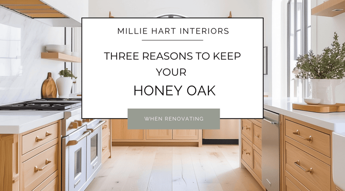
- Golden/Honey Oak: If you’ve got it, sometimes you have to keep it! While golden and honey oak's warm, golden tones can add rich contrast to Upward, they also create a more traditional and inviting look. With these oaks, I would consider balancing with cooler elements to prevent the space from feeling too warm. These wood tones can easily take the center stage, but can also be complemented by many colors. That being said, for pairing with Upward, I do prefer warmer versions of these oaks that have more orange in them than yellow. If your Golden Oak feels pretty yellow, Upward may not be the best pairing.
- Light Oak: Oaks with lighter, more neutral undertones such as white oak or driftwood oak are ideal as they enhance Upward's airy and serene qualities without overpowering it. These options have more gray undertones than Honey or Golden Oaks, and can complement Upward in a cooler color scheme.
- Dark Walnut: Dark Walnut works really well with Upward, offering distinct contrast that keeps the space light and inviting. While the pairing works with both warm and cooler tones of Dark Walnut, I personally prefer a little warmth or neutrality in the wood’s undertones over a cool gray undertone. While a cool undertone definitely works, for me the pairing just falls a little flat and chilly.
Countertops: Quartz countertops in shades of white or gray look stunning against Upward walls. For a more dramatic contrast, consider darker granite or soapstone options. Some of my picks for quartz and granite patterns that complement Upward include:
- Quartz:
- Silestone Eternal Calacatta Gold: A beautiful white quartz with subtle gray veining and hints of gold.
- Caesarstone Frosty Carrina: A soft white quartz with delicate, marble-like veining.
- Cambria Torquay: A creamy white quartz with gentle gray veining, reminiscent of classic marble.
- Granite:
- Bianco Antico: A stunning granite with a white background, gray and brown flecks, and hints of burgundy.
- River White: A light-colored granite with a white base and subtle gray and red veining.
- Colonial White: A creamy granite with a white base, gray speckles, and occasional black mineral deposits.
Tile Options: Subway tiles in white or soft gray work beautifully in kitchens and bathrooms with Upward walls. For a bit of pattern and texture, mosaic tiles with hints of blue and gray can add an elegant touch.
Hardware and Finishes: Brushed nickel or chrome hardware complements Upward's cool undertones, while matte black or brushed gold fixtures can add a modern, sophisticated contrast. For a more traditional feel, oil rubbed bronze or polished chrome finishes are great picks.
Best Rooms for Upward
Upward is incredibly versatile and works well in various rooms throughout the house. Here are some of the space I love to use Upward in:
Living Room: I love Upward in a living room as either an accent, or depending on the space, a color for all walls. It creates a calm and inviting feel. For decor, I pair Upward with neutral furnishings and natural textures, and you can also add pops of color through accessories like throw pillows and artwork.
Bedroom: For a restful retreat, paint your bedroom walls in Upward. Complement the soothing blue with crisp white bedding and soft accents for a dreamy atmosphere. Upward works well with cool and warm colors, and tons of textiles, which makes furnishings and decor easy to pull in.
Kitchen: Upward can bring a fresh, clean look to your kitchen. Pair it with white cabinets, quartz countertops, and stainless-steel appliances for a bright and airy space.
Bathroom: Transform your bathroom into a spa-like oasis with Upward walls. Add white or neutral tiles, upgraded fixtures, and plush towels for a luxurious touch. Upward can also be used in bathrooms where you might want to create a more energizing and happy place to be (perhaps in a kid’s or guest bathroom), and is easily accented with deep teals and navy blues.
Special Tips and Decor Suggestions: Making Upward Pop
To make the most of Upward, consider these decor tips and suggestions:
Accent Colors: Pair Upward with complementary colors like soft, cool greens (think muted aquas, turquoise and green-grays), crisp whites, and warm grays. Upward is also excellent with light beiges and tans. For a bolder look, accents in navy or teal can add depth and interest.
Furnishings: Light, neutral furniture pieces will keep the focus on Upward's serene beauty. Incorporate natural materials like wood, rattan, and linen for added texture.
Accessories: Enhance the tranquil vibe with accessories in soft, muted tones. Think cozy throw blankets, patterned rugs, and elegant vases filled with fresh flowers.
Sherwin Williams Upward is a versatile and calming color that can transform any room into a serene sanctuary, and I was happy to see this pick for 2024. Whether you're redesigning your living room, bedroom, kitchen, or bathroom, this delightful hue offers endless possibilities for creating a beautiful and harmonious space.
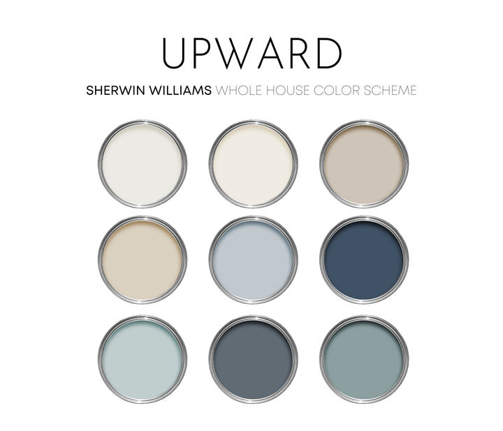
If you'd like to see my personally curated Upward palette, you can find it in my shop here. Want to grab a sample of Upward to see in your space? I love the peel and stick samples from Samplize. If you've never used them, I highly recommend their no-mess, removable samples made from real paint.
Happy painting,
- Millie
Upward Sherwin Williams Paint Palette, Interior Paint Colors for Home, 2024 Color of the Year, Coastal Colors, Pure White
$28.00
This Upward paint palette was professional created with Sherwin Williams paint colors, and features the 2024 Color of the Year, Upward. I have carefully selected a range of 9 colors for this palette, and included options for walls, trim, furniture,… read more
