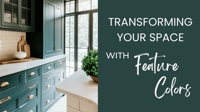
Table of Contents
Creating a home that feels connected from room to room doesn’t mean every wall needs to be the same color — it’s about finding harmony and flow. When your colors complement each other, your space feels intentional, effortless, and balanced.
Whether you love warm neutrals, soft coastal hues, or moody contrast, a cohesive palette brings it all together.
Today, I’m sharing some of my favorite strategies for choosing colors that work in harmony across your home — so every space feels distinct, yet beautifully tied together.
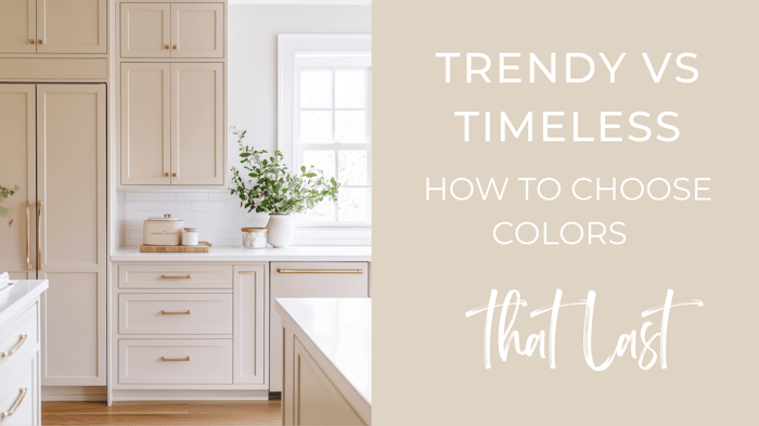
1. Start with a Base Color
Your base (or neutral) color is the foundation that carries through most of your home. It creates visual consistency and sets the tone.
Try: Soft whites, beiges, or greiges like Sherwin Williams Greek Villa, Benjamin Moore Revere Pewter, or Sherwin Williams Accessible Beige.
💡 Tip: Choose a timeless shade that gives you room for contrast. Aim for colors that differ by 2–3 shades to add depth.
2. Add Complementary Accent Colors
Your accents bring personality to each space while maintaining flow. Choose 2–3 accent colors that repeat throughout your home.
Think beyond walls — accent colors can show up in cabinets, textiles, art, and decor.
Try: Pairing a neutral base with rich tones like navy, forest green, or terra cotta.
💡 Tip: If you’re using a curated palette (like one from Millie Hart Interiors), use the pairing pages to find coordinating accent options for adjoining rooms.
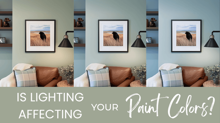
3. Match Saturation, Not Just Undertones
Warm and cool colors can live beautifully together — it’s the saturation (how clean or muted a color is) that makes them compatible.
Place your colors side by side:
If one looks “dirty,” it’s just more muted.
If one looks “too clean,” tone it down with a softer version.
When neither looks off next to the other, you’ve found your match.
💡 Tip: “Dirty” isn’t bad — muted colors with gray undertones create depth and sophistication
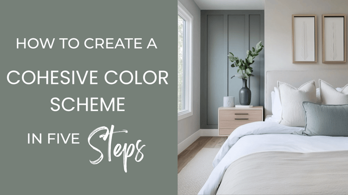
4. Create Smooth Room Transitions
To make your palette flow:
Use lighter or darker versions of the same hue in neighboring rooms.
Repeat small pops of color in textiles, rugs, or accessories.
This layering trick creates subtle continuity without feeling matchy-matchy.
5. Don’t Overthink It
A cohesive color story doesn’t have to be complicated — especially if you’re using a pre-curated palette. Millie Hart Interiors palettes are designed to remove the guesswork, giving you ready-made combinations that just work.
If you want to go a step further, try my color mapping technique to plan exactly where each color should go in your home. Check out this video, where I show you exactly how I do this!
Happy Painting,
-Millie