Table of Contents
When it comes to choosing paint colors, it’s easy to get stuck between two directions:Should I go bold with trendy colors or stay safe with timeless neutrals?
Well I have great news - you don’t have to choose! When you balance on-trend hues with classic colors, your home feels fresh, stylish, and timeless for years to come. I'll show you how!
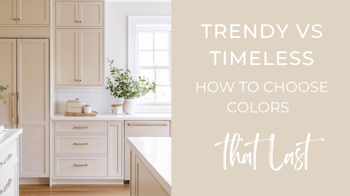
The Beauty of Timeless Neutrals
Think of timeless neutrals as your home’s foundation: calm, flexible, and easy to build on. They’re ideal for walls, ceilings, trim, and well; any surface really!
Why they work:
They're easy to update with new decor or furniture.
They create a sense of flow between rooms.
They pair beautifully with a lot of accent colors.
Some of my favorite timeless neutrals:
Warm Whites: SW Alabaster, BM White Dove
Greiges & Beiges: SW Accessible Beige, BM Revere Pewter
Soft Grays: SW Agreeable Gray, BM Classic Gray
💡 Easy win: Keep larger surfaces timeless — they’ll make any new trend feel intentional instead of overwhelming.
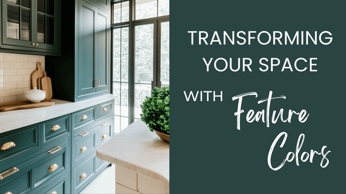
Add Trendy Colors for Personality
Trendy hues bring life and movement to your palette. The trick is using them strategically, and in smaller doses.
Try them in:
Accent walls or backsplashes
Small rooms (like powder baths or offices)
Furniture, rugs, or throw pillows
Cabinets if you're feeling a little more bold. I actually love painting cabinets in small powder rooms in fun, bold colors.
Currently trending colors:
Earthy Tones: Clay, terracotta, and rich browns (like SW French Roast)
Calming Greens: Soft sages or deep leafy tones (like BM Saybrook Sage and SW Billiard Green)
Moody Blues: Rich navy or slate tones (BM Hale Navy, and my personal favorite SW Smoky Blue!)
💡 Easy win: Adding a trendy color through textiles or artwork is easier to switch out later, and lets you experiment with color in a non-committal way)
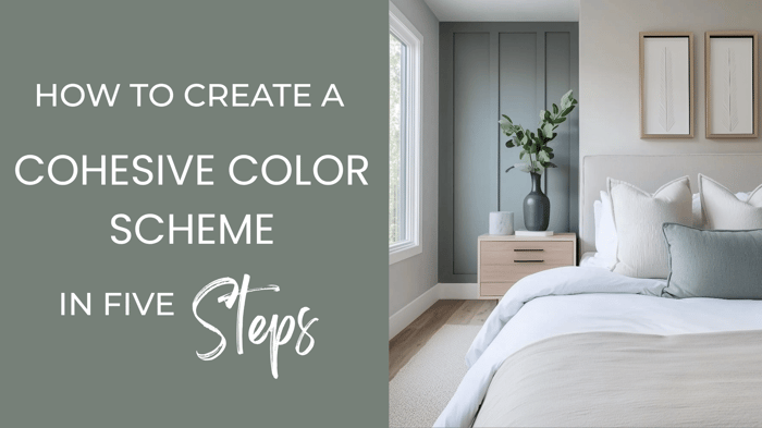
How to Balance Trendy & Timeless
Let your neutrals lead and your trends accent. That’s my special designer trick for a look that lasts :)
Try this formula:
Walls & Ceilings: Stay neutral for longevity.
Accents: Add trendy shades in decor, furniture, or cabinetry.
Textures: Layer in natural elements (wood, greenery, linen) for warmth and interest.
Example pairing:
Walls → SW Alabaster
Accent wall → SW Westhaven
Decor → Terracotta pillows, moody rug, woven accents
💡 Easy win: Keep your palette 70% neutral, 20% accent, 10% bold or experimental.
Bonus Tip: Always Test First
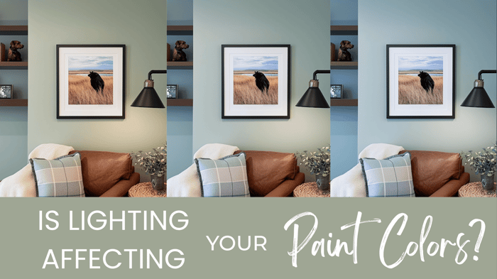
Lighting, flooring, and finishes can all shift how a color looks, so make sure you sample your colors first. Trust me. Even as a designer, I still do this; every time!
Before you commit:
Get samples — paint or peel-and-stick (I prefer peel and stick)
Test in morning, afternoon, and evening light.
Compare against furniture, trim, and flooring.
💡 Pro tip: Label your samples, noting whether you liked them, and where you want to use the colors; and keep them in a binder. You’ll thank yourself later.
Finding Your Perfect Palette
Balancing timeless neutrals and trend-forward colors is easier when you start with a curated base. My Millie Hart Interiors color palettes take the guesswork out of pairing by blending timeless and modern, livable hues that look beautiful in real homes.
Here’s to creating a home that feels current, classic, and completely you.
Happy Painting!