Table of Contents
Sherwin Williams Universal Khaki is a color I consider when someone wants warmth, without going overly beige. It feels grounded, slightly earthy, and easy to live with long-term. It is a warm neutral, but it carries more depth and structure than a typical builder beige.
It does not read flat or overly creamy. Instead, it has a slightly earthy quality that gives it more presence on the wall, without feeling heavy.
What Universal Khaki Actually Looks Like
Universal Khaki is a warm neutral with undertones that sit between beige and green. It’s not a traditional tan, and it doesn’t read flat like some builder-grade neutrals.
In most spaces, it comes across as:
A soft, muted khaki tone
Slightly earthy without feeling heavy
Warm, but not orange or golden
It has just enough depth to show up, but it doesn’t need to show off. It’s warm, cozy, and versatile enough to stand out, or lay quietly in the background - giving you the opportunity to use decor and your design style to decide where it lands.
Undertones
This is where this color gets its unique and versatile qualities.
It carries:
Green undertones
A touch of gray to soften it
The green is what keeps it from feeling like a standard beige. In certain lighting, especially north-facing rooms or shaded areas, that green can become more noticeable.
In brighter, warm light, it leans more toward a classic warm neutral.
LRV (Light Reflectance Value): 40
Universal Khaki has an LRV of 40, which puts it in the medium range.
What that means in real spaces:
It absorbs a fair amount of light, so it won’t feel bright or airy
In low-light rooms, it can look deeper and more muted
In well-lit spaces, it softens nicely and shows more of its warmth
This isn’t a color that will bounce light around. It’s better suited for creating a grounded, cozy feel.
Where I Actually Use It
I tend to use this color in spaces where a little depth is helpful but I don’t want to go dark.
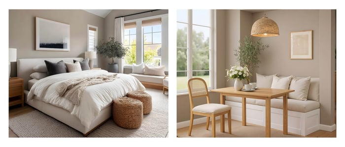
It works especially well in:
Living rooms with lots of natural textures
Bedrooms where you want a calm, slightly cocooned feel
Offices or studies that need warmth without distraction
It also works nicely on cabinetry if you want something softer, but more interesting than beige.
What It Pairs Well With
Universal Khaki is very flexible, but it really shines when paired with natural, warm elements.
Some reliable pairings:
Soft, warm whites like Alabaster
Warm wood tones like white oak or walnut
Muted greens for a layered, tonal look
Black accents for contrast without feeling stark
It also blends well with stone, linen, and other organic materials.
Design Styles It Fits Into
This color leans into styles that favor warmth and texture.
It works well in:
Modern Rustic
Organic Modern
Transitional spaces
Traditional homes with updated finishes
It’s less suited for ultra-modern, high-contrast spaces where crisp whites and cool grays dominate.
When I Wouldn’t Use It
Universal Khaki isn’t for every situation.
I usually avoid it when:
The space has very cool lighting, which can exaggerate the green
You want a bright, airy look
The home already has a lot of green undertones in fixed finishes (it can feel too heavy)
You’re aiming for a crisp, modern white-and-black palette
Universal Khaki needs the right context to feel balanced.
My Final Thoughts
This color is a solid choice if you want a neutral that feels a little more grounded and natural. It’s not flashy, but it has enough personality to keep a space from feeling flat. The key is making sure your lighting and surrounding finishes support its warmth.
If you like this kind of warm, grounded neutral, I put together a couple palettes built around Universal Khaki. They includes soft white, warm mid-tones, and a few deeper accents that work really well together in everyday spaces.
It’s available in a couple options, so whether you love a warmer, earthier palette; or a mix of warm neutrals and cooler tones, I've got you. I’ve got links below if you'd like to take a peek :)
Happy Painting,
Millie
Universal Khaki Sherwin Williams Paint Palette, Neutral Interior Paint Colors, Transitional, Warm Neutral Color Scheme

$28.00
Millie Hart's Universal Khaki paint palette was professionally created with Sherwin Williams paint colors, and features the best-selling color Universal Khaki (of course!) This scheme works beautifully with many design styles, and I love its versatility. Some of my favorites… read more
Universal Khaki Palette Two, Sherwin Williams Paint Palette, Neutral Interior Paint Colors, Warm Neutrals, Coastal Color Scheme

$28.00
Millie Hart's second Universal Khaki paint palette was professionally created with Sherwin Williams paint colors, and features the best-selling color Universal Khaki (of course!) This scheme works beautifully with many design styles, and I love its versatility. Some of my… read more
FAQs
Does Universal Khaki look green?
Yes, it can. The green undertone is subtle but noticeable, especially in cooler or dim lighting.
Is Universal Khaki a good whole-house color?
It can be, but only if your lighting is fairly consistent and leans warm. Otherwise, it may shift too much from room to room. For most spaces, it works best in individual areas or applications, repeated a few times throughout the home for cohesiveness.
What trim color works best with it?
Warm whites like Alabaster, or other warm whites tend to pair best. Bright, cool whites can feel too sharp against it.
Is it darker than Accessible Beige?
Yes. Universal Khaki has more depth and a stronger presence on the wall.